
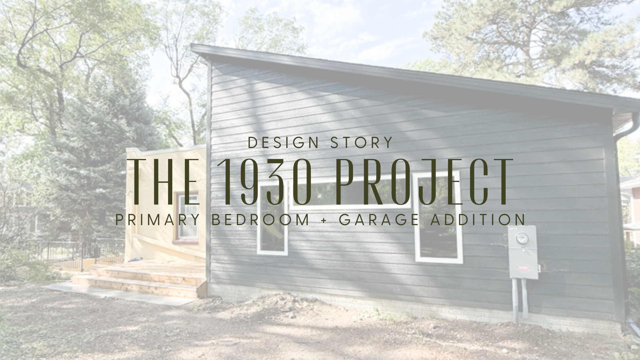
Design Story: The 193O Addition
When you add onto an older home, you face a fundamental choice: should the new space attempt to blend in, or should it be allowed to stand on its own?
For this 1930 home, mimicking the existing flat roofline would have created one long, heavy horizontal mass—essentially stacking blocks. Matching the original wasn't preservation; it was repetition. Our approach instead was to honor the home's character through contrast, not camouflage.
Here are the four intentional design decisions that shaped this addition.
1 . A PITCHED ROOF: Why Rooflines Matter More Than You Think
Here's the thing about flat roofs—they create this strong horizontal line that can start to feel really heavy if you just keep extending it. It's like adding more and more to a sentence without ever taking a breath. The original flat roof was typical for this style of 1930s home, but that doesn't mean we needed to repeat it.
By pitching the roof on the addition, we broke up that visual weight and gave the whole house some rhythm. Your eye needs variation in rooflines—it's how we naturally read buildings and find them interesting rather than monotonous. Plus, there's an honesty to it. The pitched roof clearly says, "This was added later."
2. VAULTED CEILINGS: Height Changes Everything
There's real psychology behind why vaulted ceilings feel so good. Higher ceilings literally make us feel more free—studies show they even affect how we think, promoting more open, creative headspace. Lower ceilings can feel cozy, but they can also feel like you're in a box.
For this primary suite, we weren't working with a huge footprint, so we went up instead of out. The vault gives the room a sense of generosity and calm that you can't get from square footage alone. And here's the bonus: it justified the pitched roof on the outside. The interior experience and exterior form support each other. When you vault a ceiling, you're not just making a room prettier—you're fundamentally changing how it feels to be in that space.
3. WINDOWS: Light as a Design Material
Most people think about windows one at a time—where should we put a window, how big should it be. But better design thinks about light as a whole system. How does the room capture daylight? How does that light move and change?
We wrapped the sleeping area in glass because we wanted soft, shifting light throughout the day. It's an approach borrowed from Japanese architecture, where inside and outside flow together. The room feels calm and connected to what's beyond it. And honestly, the landscape does design work that no amount of furniture or paint can replicate. When you design with light and views, the room's mood is built in. It's not something you have to decorate your way into later.
4. PRIVATE DECK: Real Function, Not Just Extra Space
Older homes almost never give adults their own true retreat. Everything flows through shared spaces. A private deck off the primary suite completely changes that dynamic—it creates a space that's accessible without going through the rest of the house.
This isn't about luxury for luxury's sake. It's about recognizing that people need restorative spaces—spots where they can mentally reset without being "on" for everyone else. A place to sit with a book that doesn't require negotiating with the rest of the household. Architects call these "threshold spaces"—not quite inside, not quite outside. But really, they're just incredibly functional. The deck makes the suite feel like a complete, self-contained retreat instead of just another bedroom.
The Guiding Principle
This addition doesn't hide, and it doesn't pretend. It belongs because every decision was made with respect for the home's age, proportion, and how people live in it today. A thoughtful addition shouldn't copy—it should fit, evolve, and elevate what's already there.
Shout Out To Our Amazing Partners On This Project:
Window Supplier: Window Options
Hardware Supplier: HDL
Garage Door Supplier: Overhead Door
Paint: Sherwin-Williams